Virtue as the organizing idea
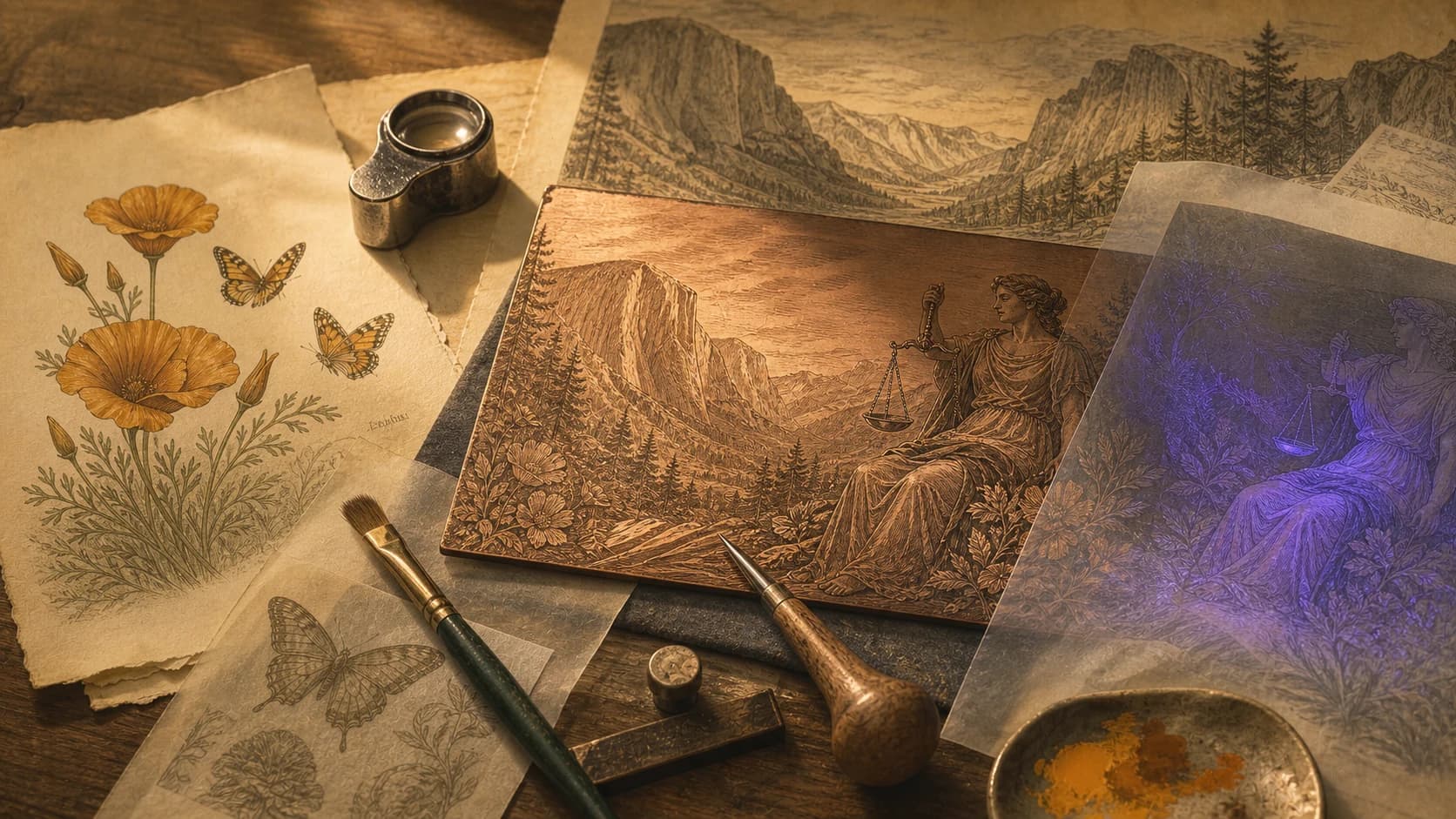
Each supplied California design centers a personified virtue. Justitia weighs justice in Yosemite. Diligentia pans for gold at Sutter’s Mill. Harmonia moves with a Pacific wave. Abundantia tends the fruits of Sonoma. The figures give each denomination a moral and narrative center rather than treating decoration as filler.
The inscription at the foot of each note acts as a compact thesis. It connects the virtue to the landscape: justice requires steady work, diligence precedes opportunity, courage can coexist with fear, and cultivation expresses belief in tomorrow.
California through precise details
The series moves through recognizable places without reducing the state to a single postcard. Half Dome and El Capitan establish the Sierra. Sutter’s Mill anchors the Gold Rush story. The Santa Monica Pier and brown pelicans locate the Pacific scene. Sonoma vineyards and Mission San Francisco Solano frame the agricultural design.
State symbols add a second reading layer: California poppies, dogface butterflies, the grizzly bear, California quail, and coastal wildlife. These details reward close inspection and make each note a small illustrated index of place.
Visible and ultraviolet storytelling
The supplied descriptions identify additional UV-layer details: water filling Justitia’s scales, gold glimmering under the river, a sea turtle beneath the wave, and a ladybug in the vineyard. Those details are not generic security decoration; they extend the story already visible in normal light.
When viewing a note, start at the central figure, follow the foreground objects, then read into the distant landscape. The composition is designed to move from virtue, to action, to place, and finally to inscription.